Print style and finishes
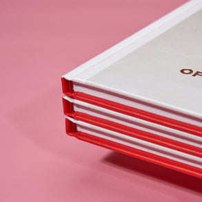
Key to any eye-catching brochure is the print style that you opt for. This is important because a great finish will draw people in by playing on their sense of curiosity. As a result, they’ll be more likely to engage with your content.
There are many print styles and finishes to choose from these days and the good news is that they are available at affordable prices. These include:
- UV finishes that shimmer under lights
- Digital foil that creates a 3D effect
- Elevated metallic, gold and silver
Colour choice
Colour is one way to get your brochure noticed and can make a real difference to the effectiveness of a campaign. The reason for this is that our brains are naturally drawn to certain colours, particularly if they are bright and vibrant. You could opt for strong reds, blues and greens to make a striking impression, or something more subtle depending on the nature of your industry. Either way, be sure to consider your overall branding to maximize impact and maintain consistency.
Paper type
The actual surface that you print on should always be given plenty of consideration. This is because the material used plays a multifaceted role in drawing interest. In other words, people will see, feel and even smell your brochure. So, be sure to invest your time and thought into something that will really seal the deal. We’ve provided a few examples below.
- Gloss paper looks impressive and is suited to brochures with visuals such as photographs. It’s not ideal when used with heavy text as it can create unwanted glare that impairs reading.
- Matte paper works well with designs that combine photos with text. This design is usually a little more expensive than other options.
- Uncoated paper provides a natural look due to its earthy texture. It's a popular choice with environmentally focused brands and makes a smart option for brochures that have a lot of text due to reduced glare.
Tip - think about what you’re trying to achieve with your brochure when choosing which paper to use. Take into account who your target audience is, what messaging you’re trying to convey, the amount of text you will need and which paper will best represent that.
Shape
The final aspect of a good brochure is the actual shape that you decide on. Think outside the box and trust that some pretty remarkable things can be achieved, be it square, triangular or even circular finishes. Going with something different will help your product to stand out from the crowd and is a great way to get noticed. Again, keep in mind the type of business that you run and be sure to pick a shape that fits well with your overall brand.
If your Melbourne business needs help designing and printing stand out brochures, then get in contact with the professionals at Half Price Printing. We can bring all of your ideas to life and promise to leave you blown away by the results.

